Archive
CFA learnings applied – The Dollar’s Impact on Stocks So Far in 2011
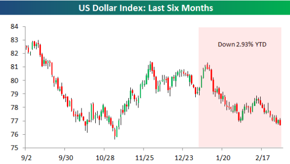
Bespoke has a nice post on the impact of US Dollar’s depreciation on earnings of US companies… this is a very simple yet very applied example of the CFA Level 2 reading on Multinational Operations.
The US dollar index (trade weighted measure against other currencies) is down about 3% in 2011. How does this affect earnings of US companies? US companies can be broadly classified in to two categories: those that do 100% of business is in US and in USD and those that do a significant share of their business globally… it is the second category of companies that are most affected by currency fluctuation…
How does USD depreciation affect stocks?
When the dollar is rising, US companies that do most or all of their business within our borders stand to benefit, while US companies with large amounts of revenues outside of the country lose out. The opposite occurs when the dollar is declining — companies with large amounts of international revenues benefit at the expense of the domestics.
If the above is not intuitive, visit my earlier post here.
As shown in the second chart below, the average YTD performance of stocks in the decile with the largest percentage of international revenues is 7.68%, which is by far the best performing decile. The average YTD performance for stocks with no international revenues is 3.09%. This performance is inline with what one would expect given the dollar’s decline.
Loosely speaking, about 3-4% of the 7.68% rise in the top performing decile can be attributed to currency depreciation and the rest to the general market rise…
Going forward, if you expect the dollar to continue its decline, the stocks with large amounts of international revenues should continue to outperform. If you expect the dollar to reverse course and head higher, the stocks with little or no international revenues should start to pick up.
…
Rising Interest Rates – thanks to QE?
If you haven’t already heard so…interest rates have reversed their downward trend to dramatically move up since the November Federal Reserve meeting, Quantitative Easing (QE2) announcement… QE2 is supposed keep US interest rates low… would you have thought that it would affect rates elsewhere?
Year-to-Date chart of Canadian interest rates…
As marked on the chart, interest rates in Canada have risen significantly over the last 6 weeks… especially the medium to long term rates in the 2-10 year terms. The 5-year rate is at 2.56%, same as in mid-July.
Here is the term chart or the Canadian yield curve… see the parallel shift in yield across all terms!
This means, borrowing costs will increase in proportion… yes, including mortgage rates, particularly fixed rates. 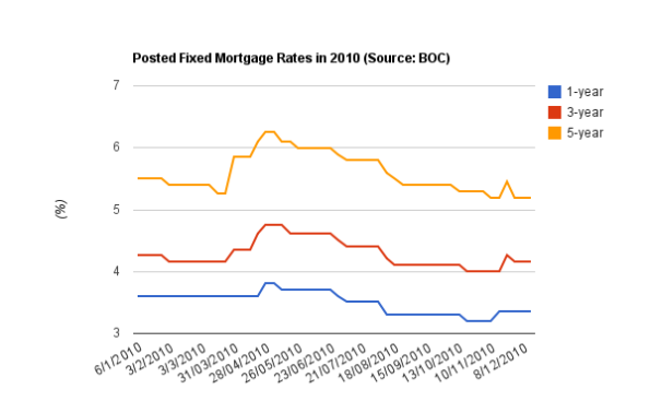
The 5-year fixed rates are as low as they have ever been… but they will be rising shortly; see this
The Bank of Canada hasn’t indicated any shift in monetary policy since the last rate hike in Sep-2010… so why are rates in Canada rising? Possible reasons:
· Higher inflation expectation
· Better than expected economic growth
· Bond markets are overbought
· Rising risk of default (!)
Stay tuned… I will explore each of these possibilities in the coming days…
Performance of Commodities since July 2010 low in S&P 500
Quick and dirty chart showing the performance of various commodities since the July 2010 low in S&P 500…(proxies)… forget Gold, look at cotton (BAL) – parabolic rise of 70% in less than 3 months!
World Stock Markets near 52 Week Highs
Close to overbought territory… Japanese equity markets clobbered due to 15-year high Yen.
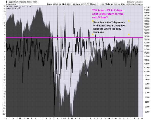
TSX is up 5% in 7 days – will the rally continue or fizzle out?
The TSX Composite index is up 4.79% in the last 7 trading sessions on increasing volume… quite the gain you might say. What is the return following a huge parabolic gain?
First, here is the 3-year chart showing the 7-day return…
Clearly there are few days where the 7-day return is greater than 5%… I suspect that is due to higher than average volatility… So I went back and looked at 10 years of data and is here the distribution of 7-day returns
Return Period – 7 days
MIN – -22.6%
MAX – 15.8%
Threshold – 5%
Observations – 2686
Observations > Threshold – 99
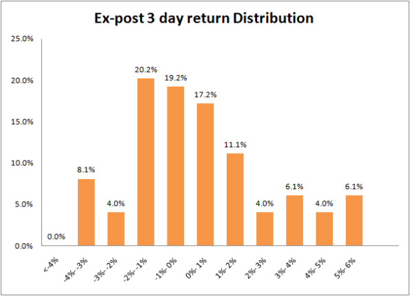
Just under 4% or 100 days in the last 10 years was the 7-day return greater than 5%… What is the 3-day return after these 99 observations? (I choose 3-days simply because it takes a lot less time to go down than to go up…yes, I’m biased to the downside)
And here is a distribution of the 3-day (ex-post) returns after the 7-day 5% rally… the positive vs negative periods are fairly distributed (52% negative vs 48% positive) but with a fatter right tail i.e. more periods with higher positive returns or in other words… the chances of higher gains are higher than higher losses.
Note: As of 10am today (03Sep2010) the TSX is up about 0.35%
Market places 10% premium over takeover price – pricing Potash at $143
This morning, Potash Corp rejected a takover offer of $130 (US) from global miner BHP Billiton citing it as “grossly inadequate” As of close yesterday, Potash was trading at USD 112.15… the takeover offer constitutes a 16% premium over yesterday’s close.
The highest Potash has ever traded – $230.09 in June 2008
52 Week High/Low – 126.98 – 83.75
Potash opened around $143 today which is $13 or 10% more than the takeover offer… I was on the call this morning with Potash and here is what I gather from the discussion:
Board of Directors are:
- open to maximizing shareholder value i.e. open to competing offers
- didn’t comment on expected/target
- expect fertilizer market to grow in 2011
- unware of government position if there was an adequate offer from a competitor. Federal government could potential block acquisition by imposing foreign ownership restrictions similar to Cameco which is the global leader in Uranium
- didn’t comment on a potential reverse takeover of acquirer
I’m waiting for Analyst reaction on what the approriate target should be…
Prior to the takeover offer, here is the target price by a couple investment banks:
- CIBC World Markets had a 12-18 month price target of $105 (as of 16 Aug 2010)
- ScotiaCapital – C$138 (as of 29 Jul 2010)
- UBS – US$120
Question:
What is the intrinsic value or Net Asset Value of Potash Corp and what is fair target price given the current and prospective agriculture environment?
Death Cross on the S&P TSX Composite?
The TSX is awefully close to a Death cross signal (50 day simple moving average crossing the 200 day moving average from above i.e. 50 day average is less than 200 day average)…
I think we are bound to get a death cross within the next week… the TSX is about 300 points away to signal the death cross as of yesterday’s close.
How good is the Death Cross signal? To answer this I looked at all the historical data I could get and analyzed the returns based on Short Selling at close on the day of Death Cross and covering and going Long at the next Golden cross (50 day SMA crosses 200 day SMA from below)
I understand 10 years is a small sample but it is better than nothing 🙂
If you only traded on the Death Cross & Golden Cross from the first signal in Nov 2000 you would be way ahead of the market for the analyzed period analyzed… hell, you would be better off just going long and sitting out until a Golden cross is recognized!
On the other hand, the Death Cross is only good half the time where as the golden cross is only good 4 out of 10 times BUT provides a better return than the death cross…
| 24-Nov-2000 | 15-Jul-2010 | ||
| Total | Death Cross | Golden Cross | |
| Short Trade | Long Trade | ||
| Total Trades | 11 | 6 | 5 |
| Winning Trades | 5 | 3 | 2 |
| % Winning Trades | 45% | 50% | 40% |
| Largest Winning Trade | 56.8% | 20.5% | 56.8% |
| Largest Losing Trade | -7.7% | -7.1% | -7.7% |
| Cumulative Compounded Return | 125.0% | 25.8% | 78.9% |
| $1000 = | 2,249.82 | 1,257.75 | 1,788.77 |
| Buy & Hold Return | 30% | ||
| $1000 = | 1,301.11 |
(If you know where I can get historical data beyond 2000, please let me know)
For more information on Death Cross & Golden cross check out:
http://ibankcoin.com/woodshedderblog/2010/07/01/what-you-need-to-know-about-the-death-cross/
Commodities & Baltic Dry Index Diverge
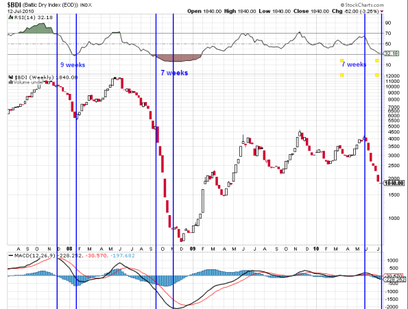
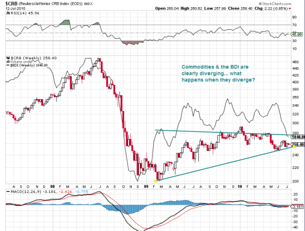
Commodities are higher today even when the Baltic Dry Index is poised to post a 7th consective weekly decline totaling 50+%… the last time BDI declined for 7 consective weeks was from Sep 09 to Oct 09 for a massive 86% drop… prior to that drop the BDI declined for 9 consecutive weeks for 44% decline!… Is the current drop a prelude to a bigger this Fall?
This chart shows negative divergence between the BDI and CRB Commodities Index… the BDI is considered a leading indicator and hence the Commodities index should follow the BDI… are commodities meant to go down?
Whats Driving the markets? David Rosenberg
David Rosenberg sheds some light from a quantitative perspective in this AM’s report …
When we go to the weekly data from the Fed, we see that “trading assets” on commercial bank balance sheets expanded to $325 billion in the past two weeks from $297 billion. And, when we go to the Commitment of Traders report, we see that there has been a big swing in the net speculation position on the S&P 500 “E-minis” on the Mercantile Exchange (futures and options) to a net long position of 28,172 contracts from 15,155 net shorts just two weeks ago. That’s a big part of the bounce-back — prop traders and short-coverings. Nothing fundamental here, as far as we can see.
S&P 500 is up 1+% on increasing trade deficit & successful sale of Greek bonds…
Canadian Provinces – Economics Comparables using Google Motion Charts
n-dimensional table by Canadian Provinces to compare relationship among following economic variables over last 5 years
- Population
- Land Area
- GDP
- Net Debt
- Net Debt as % of GDP
- Housing
- Unemployment Rate
This is a live google document using Google Motion Charts and gives a really cool visualization of changes in key economic variables over time… especially how provincial debt (as % of GDP) is on a linear rise in Canada’s most populous provinces – Quebec & Ontario.
I will be adding data as it is released…
